Between homework, classwork, job, and just life in general, there won’t be a lot of time to do recaps. Regardless, I’m going to try to knock out an entry each week. It will probably be quick and dirty, with lots of room for improvement, but it will be better than nothing. :-)
Week one was spent, with Cahlan and Britton, covering the fundamentals of git, Github, HTML5, and CSS, and slightly beyond fundamental CSS. Most of our exercises focused on writing the HTML and CSS files for webpage mock-ups. My favorite exercise was definitely the last one.
The art of simplicity is a puzzle of complexity.
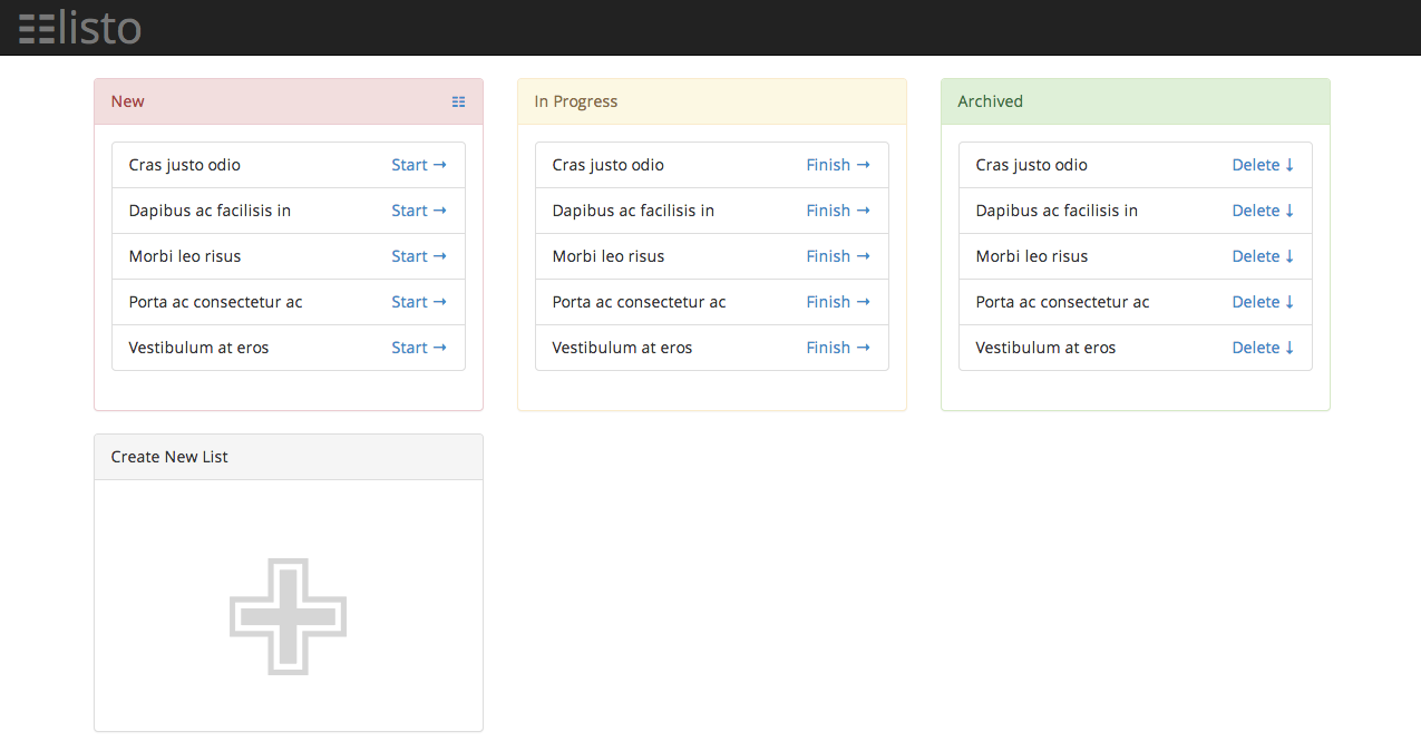
The last exercise, replicating the assessment.png had a couple of things I found challenging, including:
- Rounding specific corners
- The listo logo and icon
- Centering lists to the page
- The large, outlined “+” graphic
- Responsive design
The mockup to match: (my version)
My Challenges
Rounding specific corners
Challenge
If you take a look at the target layout, you’ll notice that the first and last list entries have two each of their corners rounded, while all the other list entry corners are standard 90° angles.
Check out what I was able to do: Sean’s result.
Result
This turned out to be much easier than I expected!
I used the :nth-child() and last-child CSS selectors, and corner specific assignment. The end result was:
|
|
The listo Logo and Icon
Challenge
The ‘listo’ logo and icon are not standard glyphs. Since we were supposed to do this with html & css, I took the generation of the logo and icon as a challenge.
Result
My general concept was to take two glyphs that exist and morph them into an acceptable approximation of the listo glyph. I used the triple equivalent symbol and a simple, lower-case letter “l” with an inverted color-scheme. Positioning the two base glyphs turned out to be particularly challenging (and time-consuming) because of browser differences. In the end, I think I did a pretty good job (at least, based on the latest Chrome Canary, Firefox, and Safari browsers).
|
|
Centering Lists to the Page
Challenge
If you look at my result[^will link when I can] and compare it to the target, especially while resizing the browser window, you’ll notice that my list cards float to the left while the target image shows them centered, relative to the page.
Result
I think this should be relatively simple operation, but it’s kickin’ my brain and I haven’t resolved it yet.
The large, outlined “+” graphic
Challenge
Like the listo logo and icon, I took the the large, outlined “+” graphic in the “Create New List” box as a challenge.
Result
Unlike the listo logo and icon, I couldn’t just mix and match existing glyphs, but it wasn’t for lack of trying. The real challenge came with making three different glyph classes (one for the inner grey +, one for the middle white +, and one for the outer grey +) that had different and relative sizes, and then getting them to overlap properly. I still haven’t resolved it yet.
Responsive Design
Challenge
In this day and age, websites should be responsive and accessible across browsers. Unfortunately, browser inconsistencies make developing such sites challenging!
Result
In this case, getting the basic list boxes and the listo logo/icon to be responsive (to screen sizes) and accessible (to user-controlled zooming) took a fair bit of tweak-it time, but it didn’t require any super-special skills.
Strangely, getting the link text (class="button") to right-align across browsers took some mental effort. (I think my very exhausted brain was confusing flex and float.)
Summary
This was a great exercise, and will probably be one I revisit as a CSS Kata (or would it be a Koan^kata-vs-koan).
If anyone has suggestions on how I should tackle the centering of the list boxes or the grey and white plus graphic, I’d love to hear them!
Results
- html-layout-first
: the goal was to match this layout - html-layout-first
: the goal was to match this layout - html-layout-first
: the goal was to match this layout
: I obviously didn’t finish the button in the upper-left corner. - html-layouts-2
: the goal was to match this layout
: I didn’t replace colors with actual matches to the png. - html-css-assessment
: the goal was to match this layout
: I could either get the top row OR the bottom row to align properly horizontally, but I couldn’t get both to align properly.